Writing a simple TimeLineView in less than 100 lines in jetpack compose.
Jetpack Compose is a declarative UI toolkit for building Android applications introduced by Google as part of the Android Jetpack suite.
It is designed to simplify and accelerate the process of creating user interfaces for Android apps by utilizing a modern, reactive, and composable approach.
Some key features of Jetpack Compose are Declarative UI, Composable Functions, State Management, Material Design Integration, Theming, Animations, Layouts, and Easy UI Testing.
Jetpack Compose is backward-compatible and can be used with existing Android codebases, so you can start adopting it gradually in your projects. It is also designed to work seamlessly with Kotlin, the preferred language for Android app development.
As Jetpack Compose is part of the larger Android Jetpack suite, it can be integrated with other Jetpack components like ViewModel, LiveData, and Data Binding to enhance app development and architecture.
What is a Time Line?
A timeline is a graphical representation of a sequence of events arranged in chronological order. It is used to visualize the chronological progression of historical or future events, showing when each event occurred or is expected to occur. You might have seen this when you order something on Amazon or Flipkart or from any e-commerce website.
Why use Jetpack compose and not the legacy UI (XML design)?
We can also do it using the XML design but the problem is it will require us to write more code. Using jetpack compose we can do it in a lot more easier way.
Let’s start with the code
@Preview()
@Composable
fun TimeLineView(
    modifier: Modifier = Modifier,
    message: String = "",
    datetime: String = "",
    isFinalItem: Boolean = false,
    index: Int = -1,
    arrSize: Int = -1
) {

    ConstraintLayout {
        val (circle, divider, card) = createRefs()
        if (!isFinalItem) {
            Canvas(modifier = Modifier
                .padding(top = 4.dp)
                .size(20.dp)
                .constrainAs(circle) {
                    top.linkTo(parent.top)
                    bottom.linkTo(divider.top)
                    start.linkTo(parent.start)
                }, onDraw = {
                drawCircle(color = Blue500)
            })
        } else {
            Box(
                modifier = Modifier
                    .padding(top = 4.dp)
                    .clip(CircleShape)
                    .size(20.dp)
                    .background(Color.Green)
                    .constrainAs(circle) {
                        top.linkTo(parent.top)
                        bottom.linkTo(divider.top)
                        start.linkTo(parent.start)
                    },
                contentAlignment = Alignment.Center
            ) {
                Icon(imageVector = Icons.Default.Check, contentDescription = "")
            }
        }

        if (index != arrSize - 1) {
            Divider(
                color = Blue500, modifier = Modifier
                    .padding(top = 4.dp)
                    .width(2.dp)
                    .constrainAs(divider) {
                        top.linkTo(circle.bottom)
                        start.linkTo(parent.start)
                        end.linkTo(circle.end)
                        bottom.linkTo(card.bottom)
                        height = Dimension.fillToConstraints
                    }
                    .fillMaxHeight()
            )
        }

        Column(
            modifier = Modifier
                .constrainAs(card) {
                    top.linkTo(parent.top)
                    start.linkTo(circle.end)
                    end.linkTo(parent.end)
                }
                .fillMaxWidth()
                .padding(bottom = 40.dp, start = 12.dp, end = 12.dp),

            ) {
            Text(
                text = message,
                modifier = Modifier
                    .padding(4.dp)
                    .fillMaxWidth(),
                fontWeight = FontWeight.SemiBold
            )
            Text(
                text = datetime,
                modifier = Modifier
                    .padding(4.dp, top = 0.dp)
                    .fillMaxWidth(),
                fontSize = TextUnit(13.0f, TextUnitType.Sp),
                color = Color.Gray
            )
        }
    }
This code defines a composable function called TimeLineView, which represents a single item in a timeline view for an Android app. The timeline view is commonly used to display a chronological sequence of events with corresponding messages and timestamps.
Let’s go through the code step by step to understand its functionality:
- The function
TimeLineViewis defined with several parameters:modifier: Allows applying additional modifiers to the entire timeline view.message: Represents the main text or message associated with the timeline item.datetime: Represents the timestamp or date-time associated with the timeline item.isFinalItem: A Boolean indicating if this is the last item in the timeline.index: The index of the current item in the timeline sequence.arrSize: The total number of items in the timeline.
-
The function uses
ConstraintLayoutas the root layout, which allows positioning the child elements relative to each other using constraints. - Inside the
ConstraintLayout, there are three child elements defined:circle: Represents the circular indicator for the timeline item.divider: Represents a vertical divider line between timeline items.card: Represents the container for displaying the message and timestamp.
-
The appearance of the
circleelement depends on whether this is the final item in the timeline or not. If it is not the final item (isFinalItemis false), a blue circle is drawn usingCanvas. Otherwise, if it is the final item, a green circle with a check icon is created using aBox. -
A vertical
Dividerelement is created to separate the timeline items, except for the final item. -
The
Columnelement represents the card containing the message and timestamp. It is constrained to be placed to the right of thecircleelement usingconstrainAs. - Inside the
Column, twoTextelements are used to display themessageanddatetimeproperties. The message is displayed in a semi-bold font, and the datetime is displayed in a smaller font and colored gray.
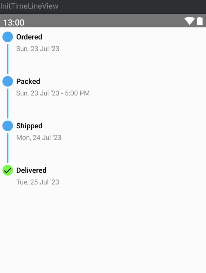
Overall, this TimeLineView composable function creates a single item view for a timeline, displaying a circular indicator or a checkmark for the final item, a vertical divider between items, and a card containing the message and timestamp. Developers can use this composable function in a LazyColumn or any other container to create a complete timeline view with multiple items. The appearance of the timeline can be customized by passing different values for the parameters when using this function.
Run this composable function with below code
@Preview(showBackground = true, showSystemUi = true)
@Composable
fun InitTimeLineView() {
    val timeLineData = arrayListOf(
        TimeLineData("Ordered", "Sun, 23 Jul '23"),
        TimeLineData("Packed", "Sun, 23 Jul '23 - 5:00 PM"),
        TimeLineData("Shipped", "Mon, 24 Jul '23"),
        TimeLineData("Delivered", "Tue, 25 Jul '23", true),
    )

    LazyColumn(modifier = Modifier.padding(4.dp), content = {
        items(timeLineData.size) {
            TimeLineView(
                message = timeLineData[it].message,
                datetime = timeLineData[it].datetime,
                isFinalItem = timeLineData[it].isFinalItem,
                index = it,
                arrSize = timeLineData.size
            )
        }
    })
}
After wiring up the above code together and running it will be displayed as -